New Hire Onboarding
Reshaping the Learning Experience using Product and Service Design Outcomes.
My Role:Learning Experience Designer
Client:LinkedIn
Timeline months
Team:L&D, QAs, Ops Manager, Team Leaders, Data Analyst + myself
The LinkedIn Talent Solutions project at TDCX Spain faced a fragmented onboarding process that left new hires unprepared and uncertain.
This case explores how we brought Product Design Outcomes to redesign the experience, as a Trainer and Learning Experience Designer, turning complexity into clarity and creating a human-centered onboarding journey that drives confidence and performance.
Learning Experience Design
Service Design
New Hire Engagement
Quality Metrics
Data-Analysis
Product Design
Problem
When I joined the project, the onboarding process lacked structure and effectiveness.
There was no dedicated trainer, and new hires struggled with:
Lack of tool training and clarity on workflows.
Overreliance on tenure reps for help, affecting productivity.
Low confidence levels and limited knowledge checks.
Declining performance scores (BANT Notes, QA).
Miscommunication and inconsistent training materials.
Absence of metrics or tracking of learning progress.
The only assessment was a single mock call with a trainer from Asia.
Most of the mistakes made by new hires stem from a lack of practice with the tools, processes, and other elements used in their day-to-day work.
Due to the 10-day delay, out of the three weeks of onboarding, only one is dedicated to training on tools and processes.
On a business level, these issues directly impacted performance, accuracy, and retention. To address this, I framed the problem using the Nesting Period Review Plan and aligned objectives with business KPIs, targeting measurable improvements in productivity, QA, and learning engagement.
Key Constraint
The client’s compliance policy prevented us from showing any tool-related content before the new hires received official access, a process that took up to 10 days, nearly the entire onboarding period.
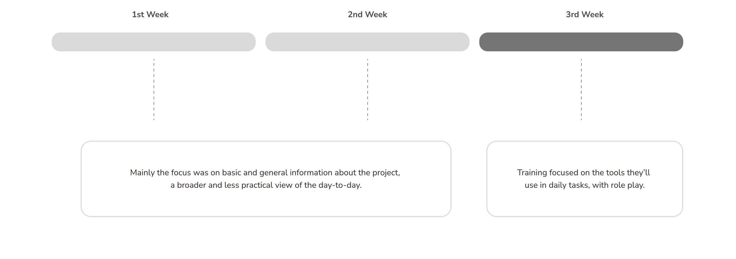
New Hire Onboarding before Redesign
1st Week
2nd Week
3rd Week

Mainly the focus was on basic and general information about the project,
a broader and less practical view of the day-to-day.
Training focused on the tools they’ll
use in daily tasks, with role play.
The main problem was the lack of emphasis on practicing the actual tools where real tasks and processes take place. As a result, error rates increased and agents didn’t feel confident performing the core responsibilities of the role once they went live.
Only 33% of the onboarding program focused on tool proficiency, while the remaining 66% was dedicated solely to general sales content and soft skills.
Challenges
How might we design an onboarding process that:
Builds new hires’ confidence before they go live.
Covers the fundamentals and tools effectively despite restrictions.
Increases performance and accuracy.
And creates a scalable, measurable framework for continuous improvement?
UX Approach
We approached the onboarding redesign using Design Thinking and UX research methodologies: treating new hires as “users” and the training journey as an experience to be improved.
Also, adding the product view and applying the double diamond framework, was possible to shape the New Hire Onboarding with a different perspective.
-
Conducted interviews with SDRs, team leaders, and the L&D team to uncover pain points.
Analyzed feedback, performance metrics, and existing content.
-
Mapped user journey and identified touch points where confidence dropped.
Ideated improvements to make the process engaging, structured, and measurable.
-
Redesigned onboarding structure including:
Weekly assessments and feedback loops.
Mock calls with structured role-play and observation checklists.
Shadowing sessions with guided reflection questions.
Weekly “Competency Goals” surveys to track progress.
Collaboration between Trainers and Team Leaders for alignment.
-
Collected feedback and data from Batch 1 to identify success and remaining gaps.
Adjusted the process for Batch 2 to strengthen tool knowledge and confidence.
Using a Qualitative UX research approach, I conducted interviews with SDRs, Team Leaders, and the L&D Department to identify pain points and patterns in the learning experience.
Methods included:
User personas and journey mapping to visualize new hire challenges.
Structured Problem Solving Toolkit to define root causes.
Empathy mapping to understand motivation, frustration, and confidence gaps.
Simple Flow Representation
This diagram illustrates how the onboarding experience evolved from a fragmented and reactive process to a structured, feedback-driven journey, highlighting key pain points and design decisions.
Before - Onboarding Structure
Week 1
Week 2
Week 3
Critical phase
Critical phase
New Hire Joins
Receives multiple materials
from different sources
No clear learning path
Delayed Feedback
Quality Issues Appear
Fragmented Onboarding;
Too much information;
Low visibility on the process;
Delay on Feedback.
After - Onboarding Structure
Week 1
Week 2
Week 3
New Hire Joins
Clear Onboarding stages and goals
Guided Learning path with checkpoints
Continuous feedback and quality tracking
Improved confidence and performance
Structured Onboarding;
Clear Checkpoints;
Ongoing Feedback;
QA Indicators.
Iteration
To close the remaining tool knowledge gap, we introduced:
Shadowing from Day 1 with structured reflection.
Opportunity Clinic (guided Dynamics 365 practice).
Weekly Competency Surveys for tracking.
These adjustments further decreased errors and made the learning curve smoother.
Because client compliance limited tool access during the first 10 days, I used mixed-method experimentation to prototype learning solutions within those constraints.
Introduced mock calls, guided reflections, and role plays to simulate real scenarios.
Used feedback loops and weekly assessments to validate assumptions.
Iterated between Batch 1 and Batch 2 based on data and learner feedback.
Results
After the redesigned onboarding implementation, the results were:
BANT Notes score improved by 7%.
Chat quality score improved by 24%.
Correct Cadence Usage in SalesLoft improved by 36.5%.
Professional Closing Statement on chat improved by 47%.
Conversion Rate from MQL to SAO improved by 6%.
Noticeable boost in confidence and readiness of new hires.
Decrease in first-week errors after introducing tool shadowing and the Opportunity Clinic.
Improved collaboration between Trainers, TLs, and QA for ongoing feedback.
Metrics were aligned with UX measurement standards using the UX Metrics Guidance (2501) framework: focusing on efficiency, satisfaction, and retention indicators.
BANT Notes score improved by
7%
Chat Quality score improved by
24%
Cadence Usage improved by
36%
Closing Statement improved by
47%
Conversion Rate improved by
6%
New Hire Onboarding after Redesign
1st Week
2nd Week
3rd Week

Training focused on the tools they’ll use in daily tasks,
with role play, shadowing and assessments.
Mainly the focus was on basic and general information about the project,
a broader and less practical view of the day-to-day.
Impact
By applying UX thinking to a learning problem, the project evolved from
a content-based training to a user-centered onboarding experience.
The process now builds confidence, reinforces learning through feedback, and aligns trainers, leaders, and new hires in a continuous learning loop.
Final Insights
The project became a practical example of applying UX in Learning Design.
By using the Design Thinking framework and Double Diamond We merged Learning Experience Design (LXD) with systems thinking.
This approach allowed better collaboration with internal stakeholders (Product, Operations, and Quality) ensuring the training design aligned with business strategy and long-term scalability.