Wine.io
User Flow
Wireframing
Usability Test
User Persona
UX Research
Analysis
Product Design
Case Study
Wine.io is a final project for the UX/UI Design course, done at CoderHouse.
It is a mobile app concept designed to help casual wine drinkers feel more confident in choosing, pairing, and enjoying wine. The idea emerged from a common frustration among new wine consumers: they want to explore wine but feel intimidated by jargon, variety overload, or lack of context when shopping or pairing with food.
This project focused on simplifying that experience while allowing room for personalization and community sharing.
Challenges
Our interviews showed that while people enjoy wine, they often feel insecure about choosing, pairing, or exploring new options.
Many rely on price or familiar grapes, seeing wine as complex or reserved for special occasions.
These insights highlighted key challenges our app could address to make wine more approachable and enjoyable for everyone.
-
Our research audience don’t understand wine terminology, grapes, or pairings.
They want to learn, but feel overwhelmed or unsure.
-
Selections are often based on price or bottle design instead of fit for the moment.
They lack tools to pick the right wine confidently.
-
Our research audience enjoy meals with wine but don’t know how to harmonize flavors.
Often default to beer or other drinks in group settings.
-
Some drink wine mostly alone, or only on Sundays.
Others see it as a “sip” rather than an accessible, everyday drink.
-
The research audience tend to repeat the same grape (Carménère, Malbec, sweet wines).
They are curious about exploring but don’t know where to start.
-
Many avoid spending more than a certain amount on wine.
They fear making the “wrong” choice with a more expensive bottle.
“I don’t really know much about wine, but I’d love to understand more. Most of the time, I just pick something cheaper or a bottle that looks nice.”
“When I’m with friends or family, I usually end up drinking beer instead of wine. It feels easier to choose.”
Research & Insights
To better understand our users and the wine market, I conducted a mixed-method research process combining user interviews, proto-personas, and desk research.
User Interviews (Qualitative, Generative Research)
Conducted with wine consumers at different knowledge levels. Helped uncover behaviors, preferences, frustrations, and motivations related to wine consumption.Proto-Personas (Assumption-Based + Interview-Validated)
Building initial personas (like Davi and Giovanna) to capture potential user needs, then validated/refined them through interview insights.Desk Research (Secondary Research)
Researched market data, industry reports, and statistics (both global and Brazilian) about wine consumption patterns and wine app usage
to contextualize findings.
Outputs from the Research
User Insights: People feel insecure choosing wines, often rely on price or bottle design, struggle with food pairings, and prefer safer options like beer. Curiosity exists, but confidence and budget are barriers.
Challenges Identified:
Low wine knowledge
Difficulty choosing
Uncertainty about pairings
Perception of wine as “special occasion only”
Limited variety explored
Fear of making wrong (expensive) choices.
Market Context: In Brazil, 70% consumed wine in last 6 months; 52% weekly/daily; 80% prefer red; most spend R$30–70. Global apps like Vivino (65M+ downloads) show demand for digital discovery tools.
How Might We:
Help users explore wine with confidence, regardless of knowledge?
Make pairings with food and moments effortless?
Reduce fear of wrong choices by showing good options within budget?
Personas:
Davi: Host, loves to cook but struggles with pairings.
Giovanna: Relaxes with wine, seeks easy labels & quick recipes.
We selected 15 people that are wine enthusiastic but don’t consider themselves as experts. We mapped user behaviors around meal planning, casual wine consumption, and existing mobile
app patterns.
The key insight was that users don’t want to study wine, they want to enjoy it. That led to a UX principle: the app should feel more like a friend’s helpful suggestion than a textbook.
We shaped two personas, one representing a young adult living alone or with a partner, with limited time to cook and low wine knowledge, but high curiosity: Giovanna.
The second persona represents a curious and sociable person that loves to cook and explore new wines at home, with a certain level of wine acknowledgement. His big problem is how to match a good wine with sophisticated dishes that he loves to risk cooking? This is Davi.


Designing the Experience
Our main insight was that users don’t want to study wine. They want to enjoy it with confidence. With that in mind, we designed an experience that feels intuitive and emotionally connected, guiding users subtly rather than overwhelming them with information.
The app offers three main discovery paths, each responding to a different user mindset or moment:
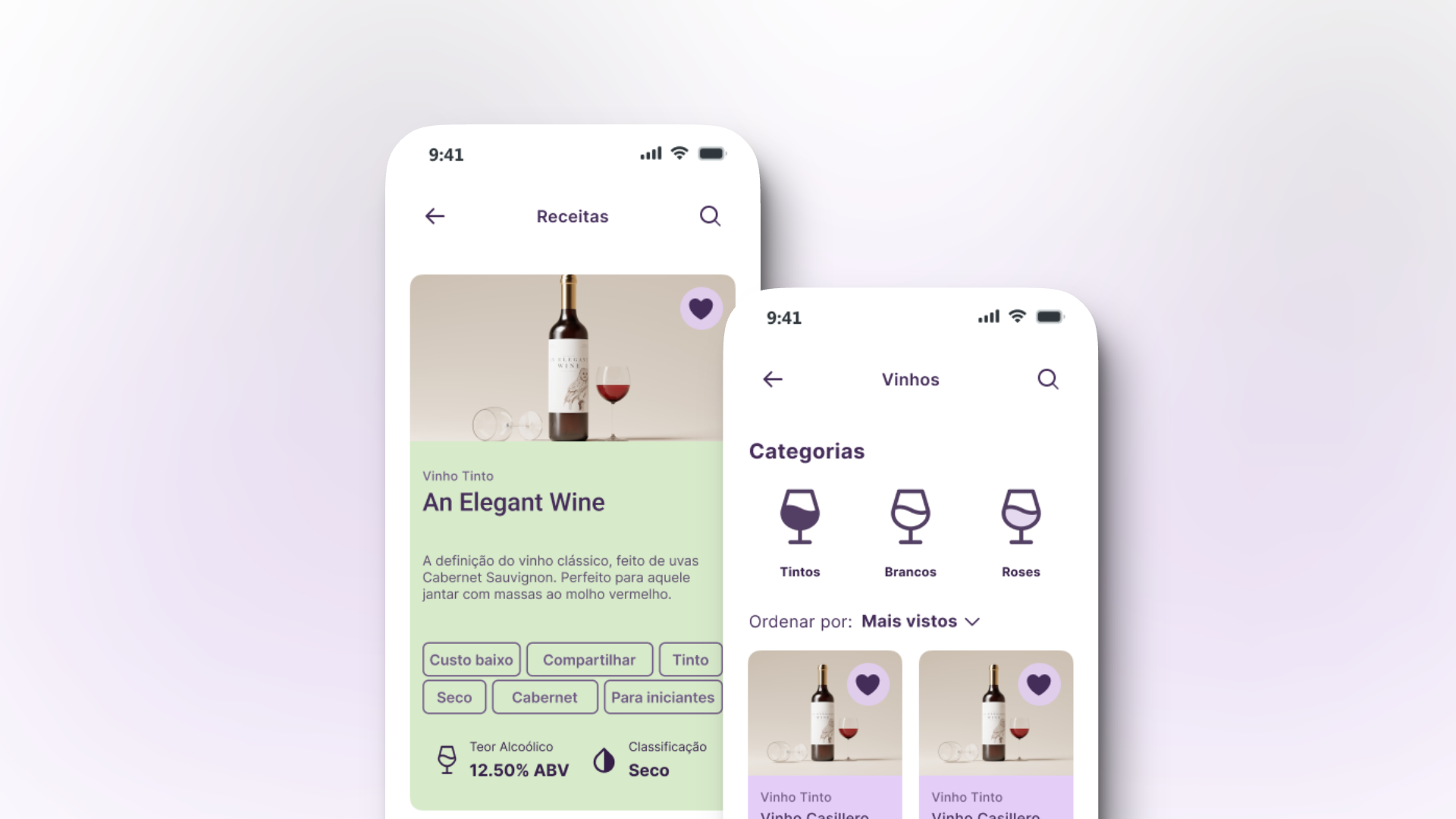
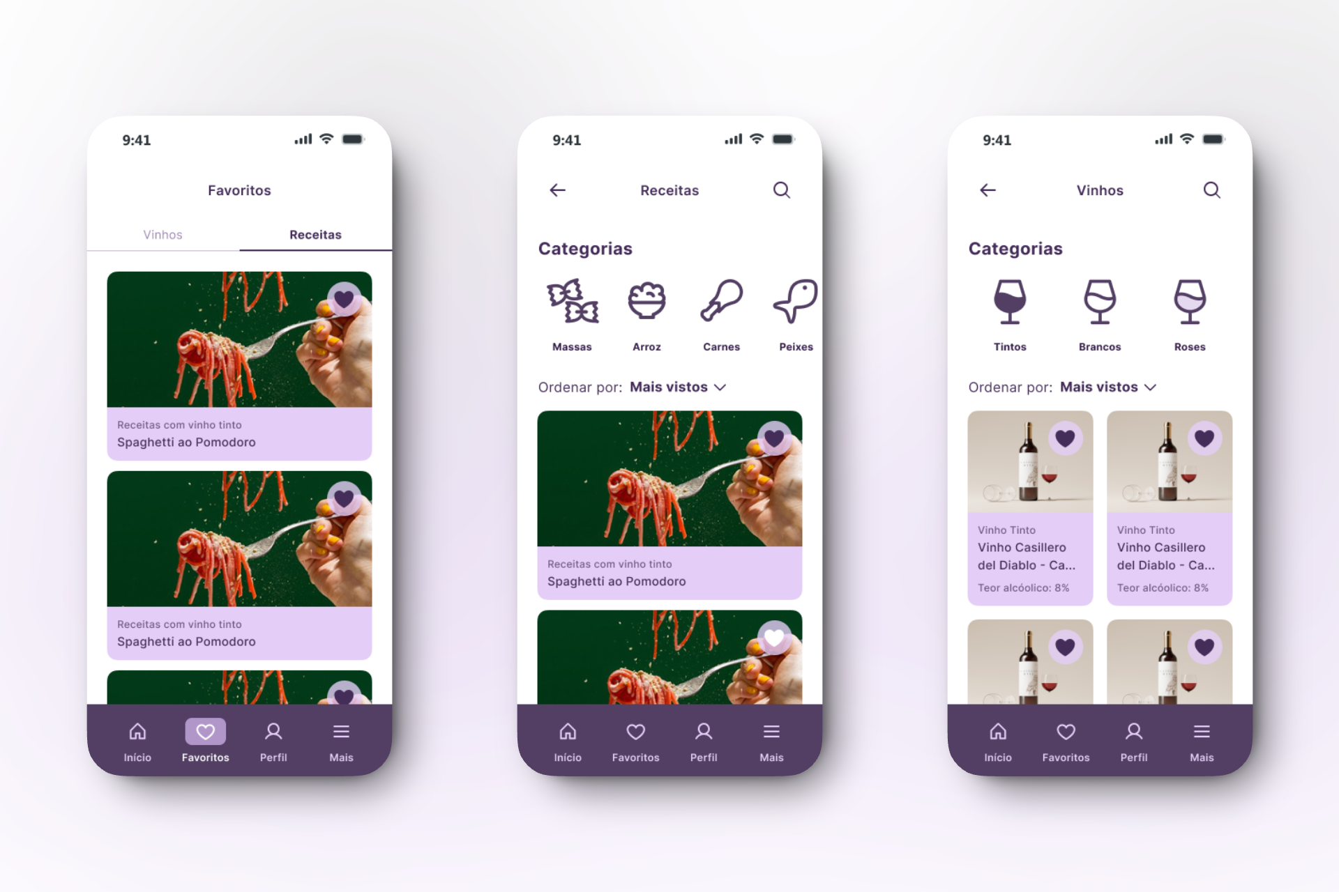
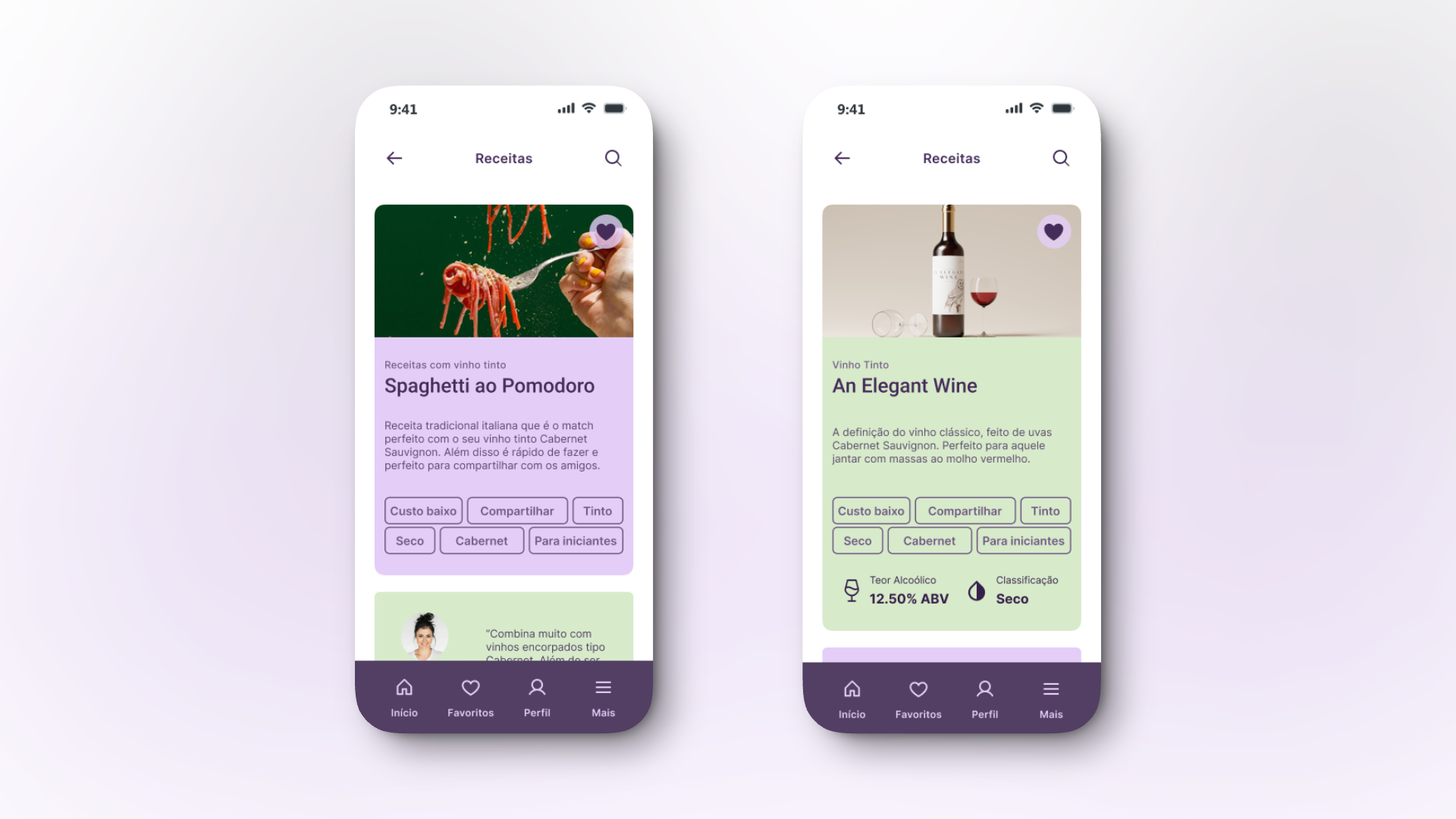
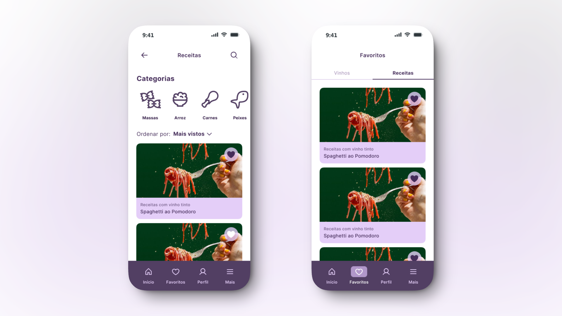
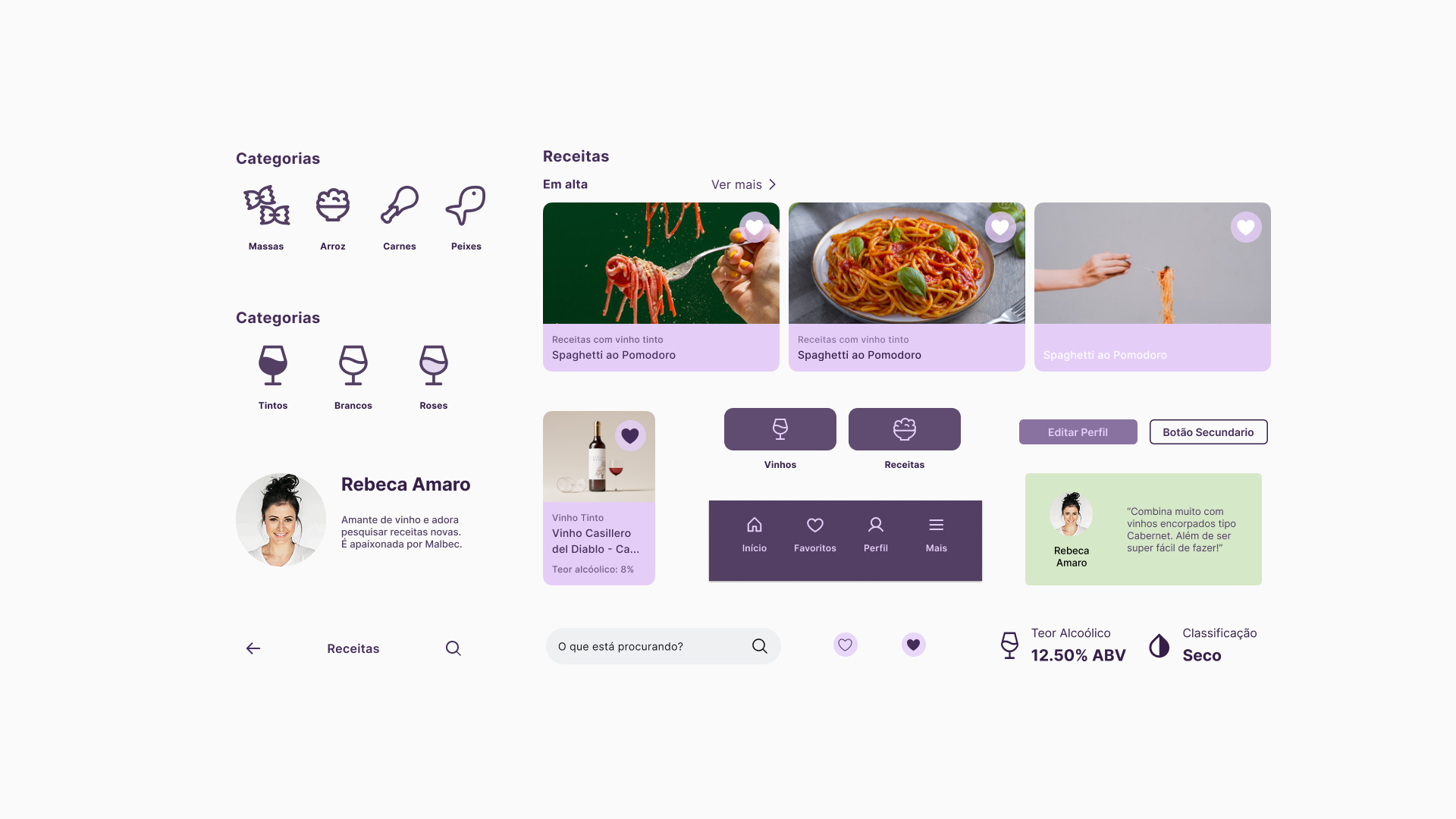
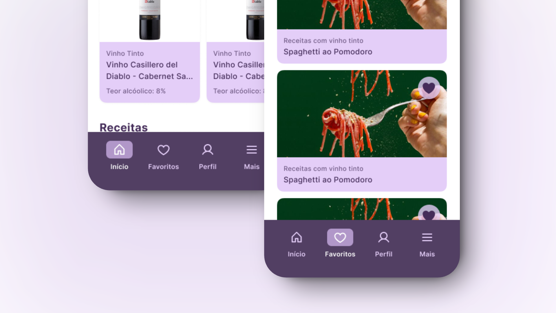
Search by Recipe – Users can type what they’re cooking, and the app suggests wines that pair perfectly, removing the guesswork from the experience.
Search by Mood or Occasion – Options like “date night,” “self-care,” or “picnic” make choosing a wine feel personal and effortless.
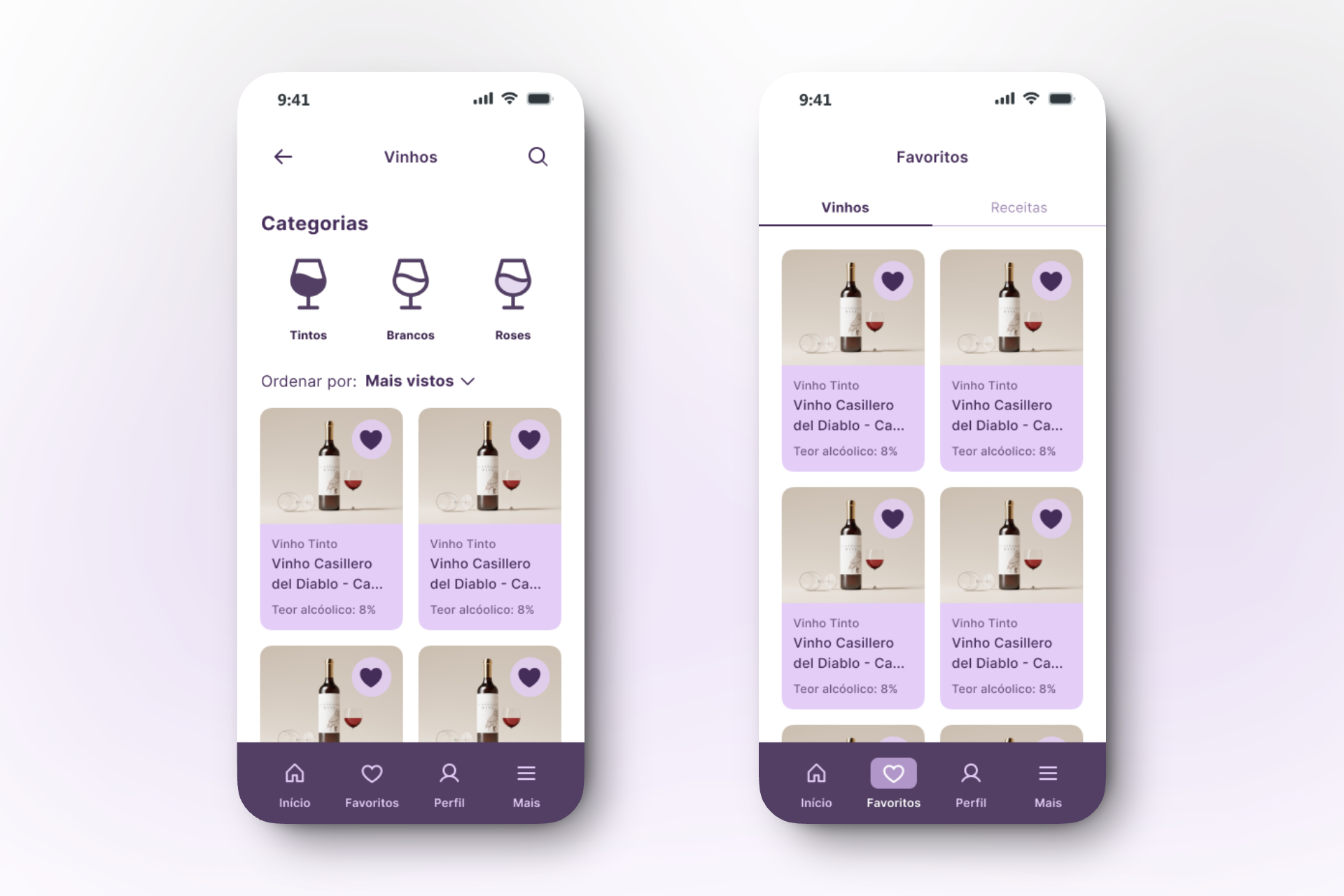
Explore and Save for Later – Users can browse, discover, and save wines that catch their attention, gradually building familiarity and confidence.
Each path was designed to reduce decision fatigue. Instead of forcing users to compare dozens of labels or memorize technical terms, the app simplifies the process, while still providing space for those who want to explore further.
These design decisions directly reflect our research findings:
Faced with low confidence and confusing terminology, we offered contextual entry points.
Unsure about food pairings? We built a “recipe-to-wine” journey to match both worlds.
Sensitive to price and afraid of “choosing wrong”? The app suggests great options within the user’s budget.
Visually, the interface prioritizes clarity and warmth: it has clean hierarchy, friendly tone, and an experience that feels more like advice from a friend than a sommelier speech.
Ultimately, the goal was to make users feel understood and supported, turning the act of choosing wine from something intimidating into something enjoyable, personal and fun.
Our User flow was crafted to prioritize discovery through three main pathways:
Search by recipe: user inputs what they plan to cook
Search by mood or occasion: date night, self-care, picnic, etc.
Explore or save wines for later
Each path was designed to reduce decision fatigue and give just the right amount of guidance, with room to deepen the experience over time.
The Storyboard
The user’s journey represents the experience of users who love wine but feel uncertain when choosing it. Her story shows how the app guides her from confusion to confidence, turning a complex decision into a simple and enjoyable moment.

User Journey
Planning the evening
Joana is hosting dinner for her friends and wants everything to feel special. She decides to buy a wine, but choosing the right one isn’t easy.Facing uncertainty
At the store, she’s surrounded by options. With little knowledge about wine, she’s unsure what to pick or how to pair it with food.Remembering the app
Then Joana remembers she has a tool that can help her.Exploring with guidance
She opens the app, searches by recipe and mood, and quickly finds the wines she was considering. Clear descriptions help her understand which fits best.Feeling confident
Using filters and reading other users’ reviews, Joana compares options and makes her choice with confidence.Enjoying the moment
That night, the dinner is a success. The wine fits perfectly with the food and mood.Sharing her experience
Afterwards, Joana rates the wine in the app, helping others find their perfect match too.

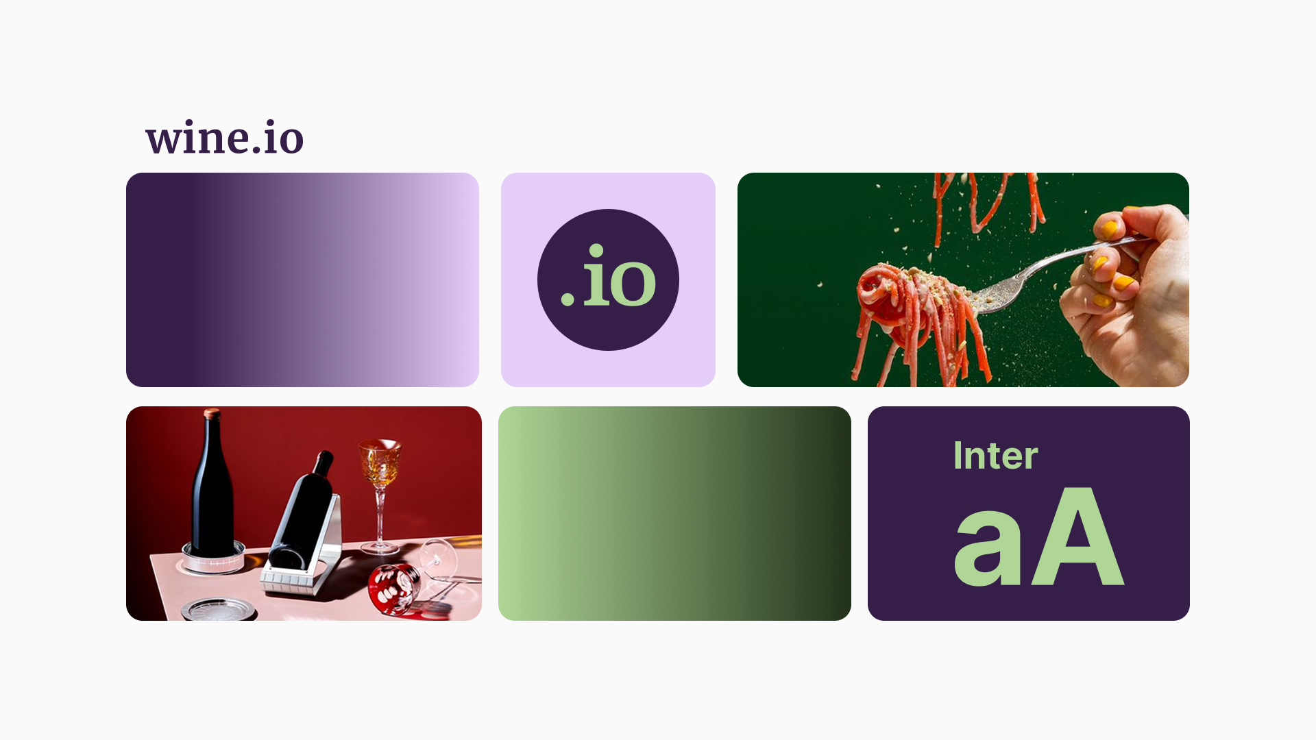
Visual Design
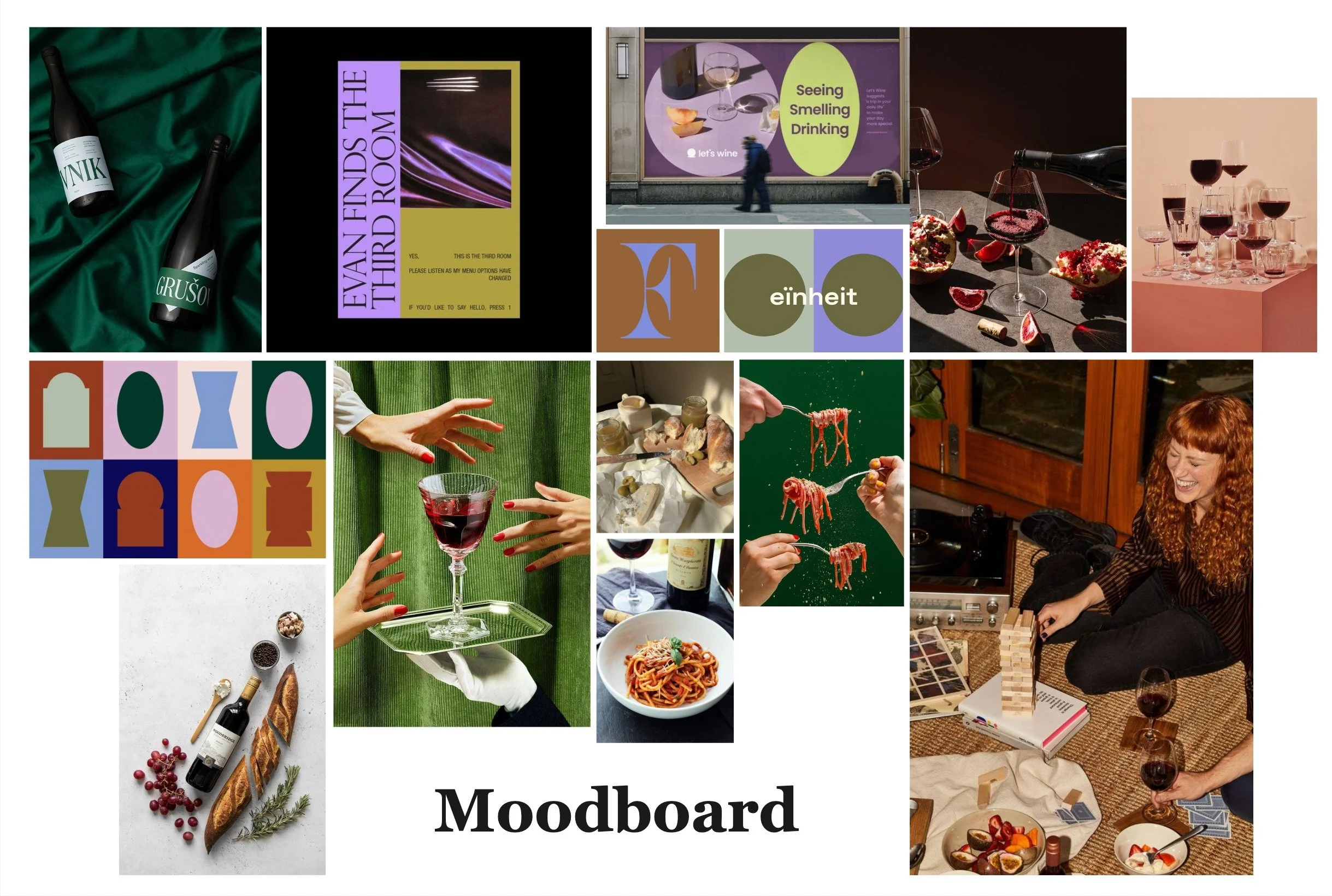
The visual style of Wine.io balances warmth and elegance, drawing from the natural tones of vineyards, wood, and wine itself. The interface needed to feel both welcoming and modern, far from the intimidating or overly serious tone many wine brands carry.
We had the challenge to work with short time and no space for craft the Design System since the beginning. In order to feel secure and work with limitations, we relied on Material Design to compose the base of our UI Kit.
Since we didn’t have time to develop a custom design system from scratch, relying on an existing and well-tested framework allowed us to move faster and ensure consistency. This choice gave us the freedom to focus our efforts on what truly mattered: designing intuitive flows, meaningful interactions, and the core tasks within the app experience.
The UI Kit included:
A muted yet rich color palette
Soft-rounded iconography
Clean type hierarchy
Modular card-based layouts for browsing and saving wines
Accessibility was also considered, especially in contrast and font size balance.

Style Guide
Usability Testing
& Iteration
Testing was conducted on the mid-fidelity prototype with participants simulating basic flows (searching, saving, pairing). Here’s what we learned:
Strengths: The tone was friendly and approachable.
Users completed tasks quickly and enjoyed the interface.
Pain points: Search bar positioning confused some users;
recipe-to-wine linking needed to feel more contextual; the login flow needed clearer guidance.
Based on these, I improved search visibility, clarified recipe-wine relationships with visual cues, and simplified onboarding.
Solution Overview
All these insights guided every design decision, shaping an experience focused on confidence, discovery, and simplicity. The final solution brings these values to life through a clean and intuitive interface where users can explore wines by mood, recipe, or moment, supported by friendly language and visual cues that make the process approachable.
The prototype reflects a journey from uncertainty to enjoyment: what begins as confusion becomes curiosity, and ends in confident choice. Through thoughtful UX, warm visuals, and human-centered interactions, Wine.io transforms the complexity of the wine world into an experience that feels personal, enjoyable, and easy to savor.
Final reflection
Coming from a background in visual design and customer support, this project was where those two worlds connected for me: empathy and clarity.
I focused less on fancy screens and more on making users feel guided, not judged. That’s something I now carry into all my product design work, especially in onboarding, education, and micro-interactions.
Outcome
This project gave us space to practice not only interface design, but also product thinking: designing for behavior, emotion, and real-world friction.
While fictional, Wine.io became a meaningful exercise in aligning user delight with business value. It showed how even a culturally rich topic
like wine can be made inclusive through thoughtful design.